
Performance without context can lie.
Most dashboards tell you what happened: how many leads arrived, how many appointments were booked, how many listings you won, or how much revenue you generated. Those numbers matter. But on their own, they do not tell you whether the result was actually good.
An agent can receive fewer inquiries and still be gaining ground in a market where active inventory and transaction opportunity are shrinking. Another agent can grow while quietly losing share in a market that is expanding even faster. The same result can mean something very different once you see the environment around it.
Leads, appointments, listings, conversions, revenue, and the goals you set.
Inventory, price, market pace, reductions, seasonality, and the direction of your local market.
You need a view of your local market—and the national market around it—before you can make a fair judgment about your own performance.
The housing market changes the difficulty of the job.
When inventory, pricing, and days on market move, the number and urgency of potential clients move with them. That affects how many opportunities exist, what sellers expect, what buyers need explained, and how long a decision may take.
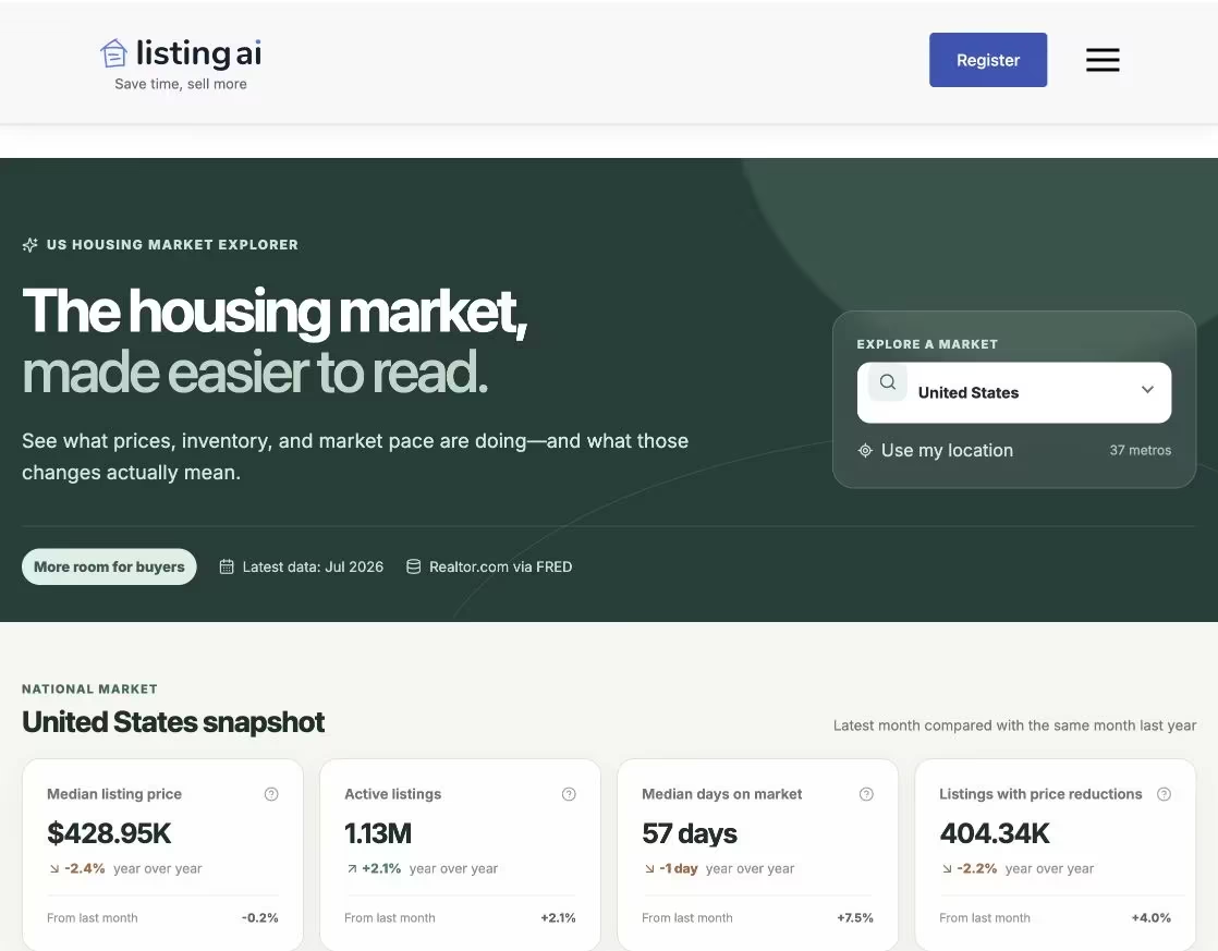
Look beyond one headline number
Price alone does not describe a market. The useful picture comes from reading several signals together.
- Median listing price
- Active listing count
- Median days on market
- Listings with price reductions
We were asking the same question about ListingAI.
When ListingAI gains more customers, we want to know why. Are more agents finding us because our marketing is working better? Is the housing market creating more demand? Did both happen at once?
The reverse question matters just as much. If we are struggling to hit a goal, is that a marketing problem we need to fix—or are agents everywhere working through a slower, tighter market with fewer immediate opportunities?
Are the results changing because of the market, or because of the marketing?
We could see our own performance. We needed a clearer way to see the conditions surrounding it.
Market Stats makes the comparison easier to read.
The free explorer starts with the US market and currently includes 37 selected metros. It brings price, inventory, days on market, reductions, and year-over-year movement into one place, then adds plain-language summaries so the chart is not left to explain itself.
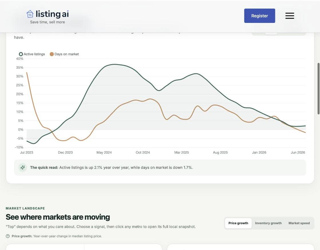
Compare opportunity with market pace
A rise in listings means something different when homes are also taking longer to sell. Putting the signals together creates a more useful story.
- Switch between monthly values and YoY change
- Compare related metrics on one timeline
- Read the quick takeaway below the chart
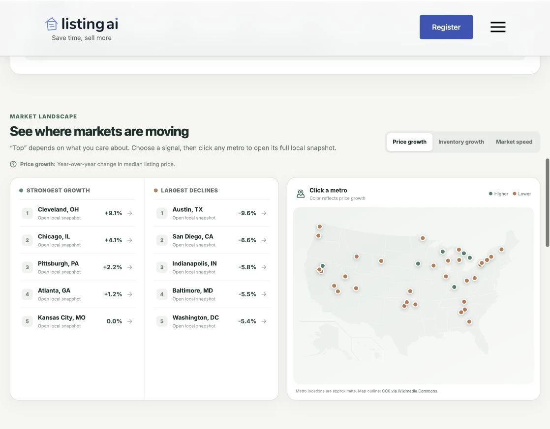
See where selected markets are moving
Rankings and a clickable map make it faster to move from the national picture into a supported local market.
- Strongest growth and largest declines
- Price, inventory, and speed rankings
- Direct paths into each metro snapshot
Source: Realtor.com® Economic Research, Housing Inventory Core Metrics, retrieved from FRED, Federal Reserve Bank of St. Louis. ListingAI calculations. Coverage and release timing vary by series and metro.
Put your own results beside the market.
Market context does not grade your business automatically. It gives you a more honest starting point for the questions you ask about it.
- 1Start with the market
Look at the US baseline, then choose the closest supported metro. Notice what changed in inventory, price, days on market, and price reductions.
- 2Compare the same period
Year-over-year context helps separate a normal seasonal swing from a more meaningful change in market conditions.
- 3Put your numbers beside it
Compare your inquiries, appointments, listings, conversions, or revenue with the opportunity and pace visible in the market.
- 4Ask the harder question
Did your results change because the market changed, because your marketing changed, or because both moved at the same time?
A flat result can be stronger than it looks when the available opportunity has contracted.
That does not make the result bad—it tells you to look harder at share, conversion, and channel quality.
Context is not causation.
No market chart can prove why one campaign worked, why one listing converted, or why one month missed a goal. Your offer, message, follow-up, budget, reputation, and execution still matter. So do changes that a metro-level series cannot capture inside one neighborhood.
It should sit beside your CRM, analytics, pipeline, and local knowledge—not replace them.
It helped us. Hopefully it helps you too.
Search the national market or a supported metro, compare the signals that matter to you, and use that context the next time you ask whether your results came from the market—or the marketing.